SUMMARY
Riviera has a strong foundation worth retaining: its name, pastel palette and Mediterranean positioning already give the brand a distinctive character. The main opportunity is to simplify the packaging, strengthen the hierarchy and make both Riviera and the individual flavours easier to recognise at a glance.
The aim should be to evolve rather than replace—building greater shelf impact, clearer flavour communication and a more ownable visual identity without losing the brand’s natural, understated feel.
I'm sure you've already spent a lot of time analysing your packaging, but I've included a general breakdown of the current design, alongside a breakdown of the customer and professional feedback you've received and how this can translate into new thinking for the packaging and wider brand. I've gone into quite a bit of detail so we can really exhaust the ideas and fully understand both what is and isn't working before looking at where the design could go next.
initial thoughts on areas to improve
Too much text The current can relies heavily on verbal communication. Packaging has to work quickly and at a distance, so visual processing, recognition and hierarchy matter more than explaining every selling point in copy. Too many competing messages also increase cognitive load and dilute what consumers actually notice first.
Weak information hierarchy. A lot of the copy has similar typography, scale, weight and positioning, so there isn't a strong visual journey through brand → flavour/product → supporting information. It makes individual pieces of information feel placed onto the can rather than composed as a system.
Logo opportunity. The Riviera type itself is strong and worth retaining, but the sunburst/glyph feels less resolved in its current relationship with the wordmark. There's an opportunity to refine it into a recognisable standalone brand device, giving Riviera visual recognition without always needing the full name.
Limited flavour communication. The packaging doesn't immediately give you enough sensory information about what you're about to drink. Fruit/flavour imagery can communicate taste almost instantaneously and make the individual SKUs easier to recognise.
Things I like and would keep to retain in the brand identity
Pastel identity. Conventional packaging logic might push toward brighter, higher-saturation colours for shelf impact, but if competitors increasingly follow that logic, Riviera's restraint itself becomes differentiating. It also fits the product positioning: very bright, saturated colours can connote sweetness, artificial flavouring or high sugar, whereas the softer palette better supports natural, light and refreshing.
Bottom flavour band/pattern. I like this as an existing Riviera device and want to retain it. It creates a unique flavour identifier that remains visible around the circumference of the can. Pastel colours alone aren't always sufficiently explicit, particularly something like pale yellow. So the redesign should strengthen the flavour cue around this existing device rather than replace it.
Looking at feedback
Negatives
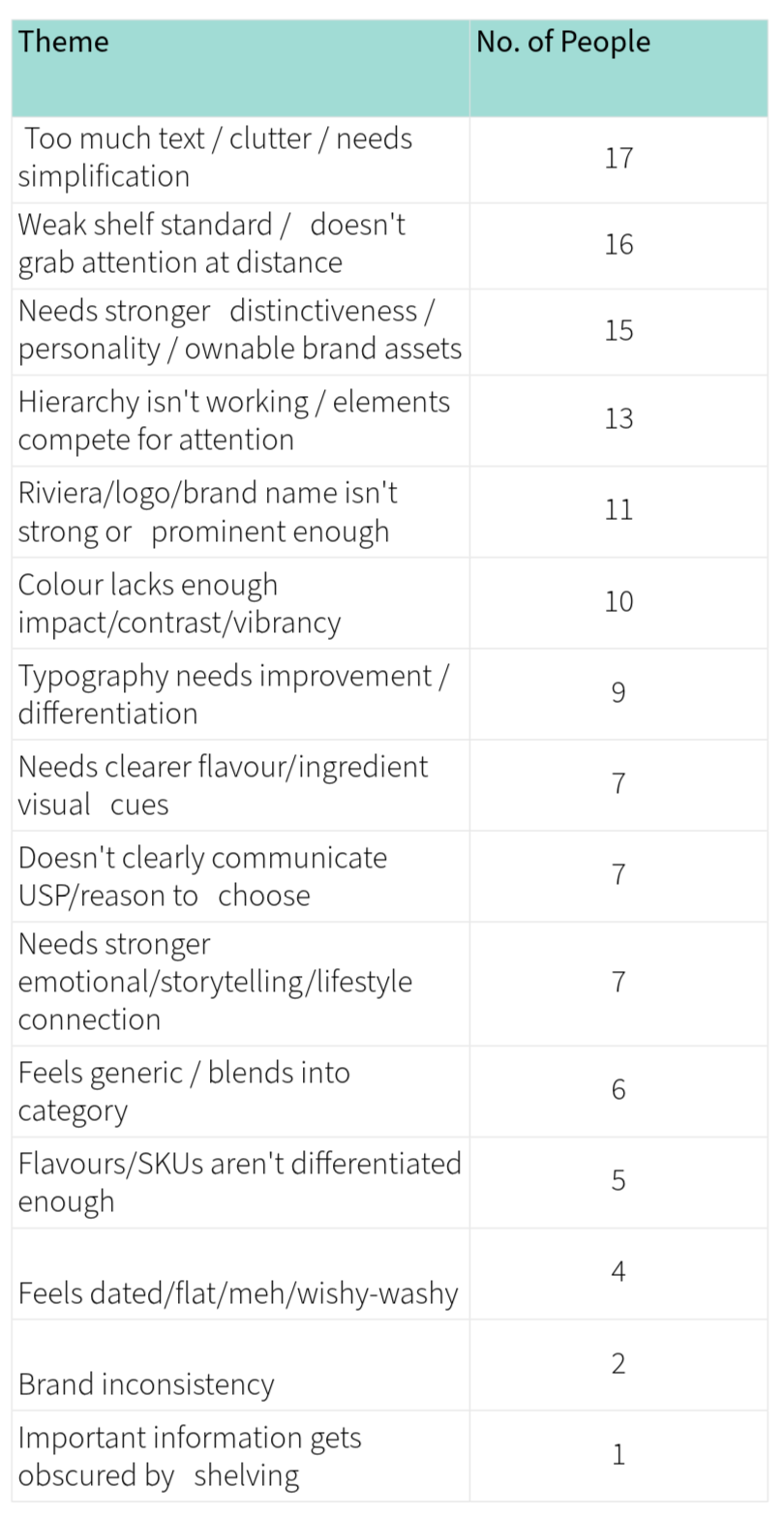
There are essentially five dominant problems:
1. Too much information.
2. Poor shelf impact.
3. Weak brand distinctiveness.
4. Poor hierarchy.
5. Riviera itself isn't prominent enough.
2. Poor shelf impact.
3. Weak brand distinctiveness.
4. Poor hierarchy.
5. Riviera itself isn't prominent enough.
However weighing up the positive views also helps balance and present a clearer direction for the new package designs
Positives
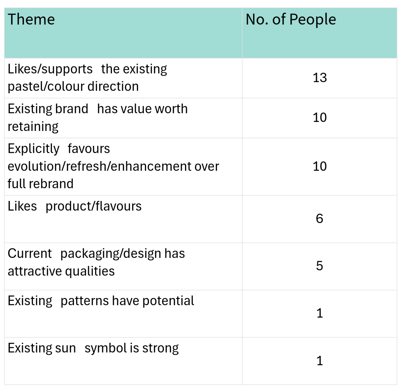
A lot of the feedback doesn't support throwing what you currently have away, but to use the best bits of your current design language and elevate it while following feedback with purpose.
Idea Suggestions
Brand hierarchy
Make RIVIERA larger and bolder — Chris Needle, Kate McCabe.
Riviera should dominate the flavour rather than compete with it — Jo Samuel, Ann Storr, Jamshed Aziz.
Make ICED TEA smaller/subordinate — Chris Needle, Hannah Wilson.
Use one consistent Riviera colour across every SKU — Chris Needle.
Align flavour positioning consistently across the range — Richard Clark.
Copy
Strip front-of-can messaging to the bare minimum — Mark Allen.
Remove the repeated flavour from the descriptive sentence — Hannah Wilson, Chris Needle.
Chris Needle suggests simplifying it to something like "Naturally delicious, Mediterranean inspired."
Give the copy more personality rather than purely describing the product — Ann Storr.
Clearly communicate why Riviera is different — Ceri Angel, Mike Lopez, Claire Bristow.
Colour
Keep the pastels but increase their intensity — Chris Needle.
Pastel backgrounds + punchier/neon typography — Chantelle Johnston.
Stronger text/background contrast — Elena Galli.
Use flavour-specific colour more deliberately — Kate McCabe.
Develop more ownable colours around individual flavours — Chloe Norman.
Flavour system
Give every flavour a memorable name/personality — Elena Manfredi.
Create an individual pattern/illustration for each — Elena Manfredi.
Make individual cans much easier to distinguish — Nick Heller, James West.
Use flavour imagery so customers recognise the flavour without reading — Sarah Hughes, Kate McCabe.
Riviera world
Lean harder into what "Riviera" actually evokes: coast, Mediterranean, luxury, travel, retreat, hospitality — Sadrah Schadel, Ryan Murray, Lucy Barker.
Make the can emotionally "transport" someone somewhere — Elena Manfredi, Sadrah Schadel, Lucy Barker.
Give Riviera a stronger personality and voice — Jo Samuel, Ann Storr.
Build a unified brand narrative — Christopher Santoro.
Potentially tell the female-founder/personal story on the rear — Sadrah Schadel.
Brand assets
Develop the existing sun into a recognisable master-brand symbol — Chris Needle.
Preserve/develop existing patterns — Christopher Santoro.
Double down on one distinctive asset: colour, texture, can shape etc. — Mark Allen.
SUMMARY
Do not redesign Riviera into another loud generic drinks can just because bold drinks packaging is fashionable.
EVOLVE, DON'T REPLACE
Preserve:
Pastel character + Riviera name + Mediterranean positioning + existing useful brand assets.
Pastel character + Riviera name + Mediterranean positioning + existing useful brand assets.
Fix:
Clutter + weak hierarchy + weak Riviera prominence + weak shelf contrast + poor SKU differentiation.
Clutter + weak hierarchy + weak Riviera prominence + weak shelf contrast + poor SKU differentiation.
Add:
Ownable visual device + stronger flavour cues + Mediterranean emotion + clear product benefit + recognisable distance silhouette.
Ownable visual device + stronger flavour cues + Mediterranean emotion + clear product benefit + recognisable distance silhouette.
James West's two-metre squint test is probably the simplest success criterion for whatever you design: if you blur/squint at the finished cans on a shelf, you should still immediately see RIVIERA, recognise the brand system, and distinguish one flavour from another.
Quick Designs
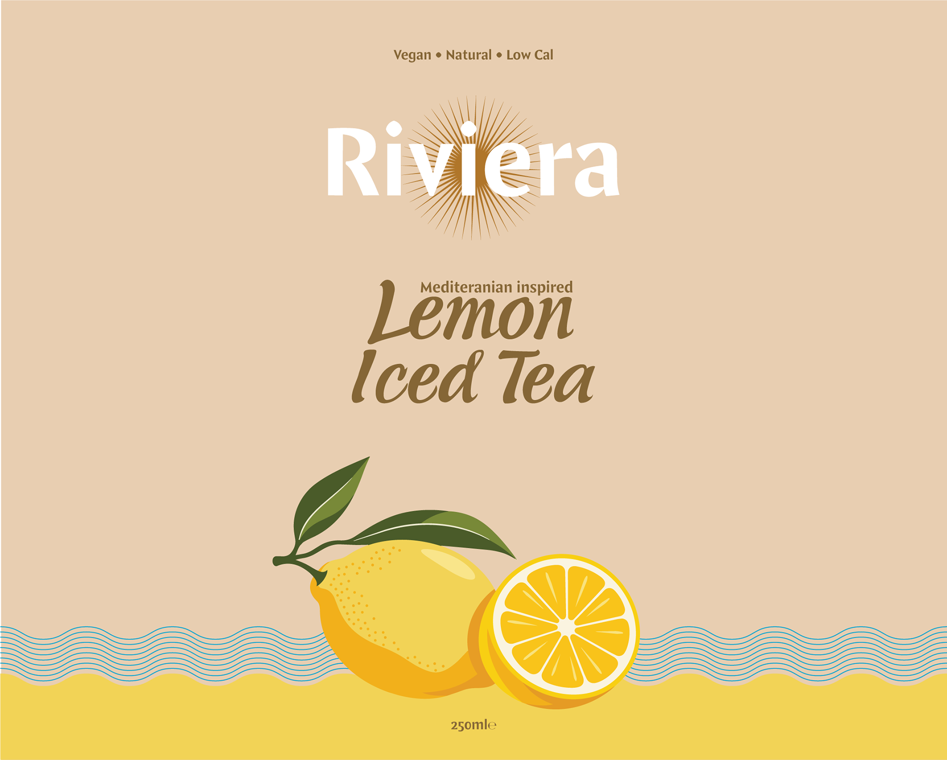
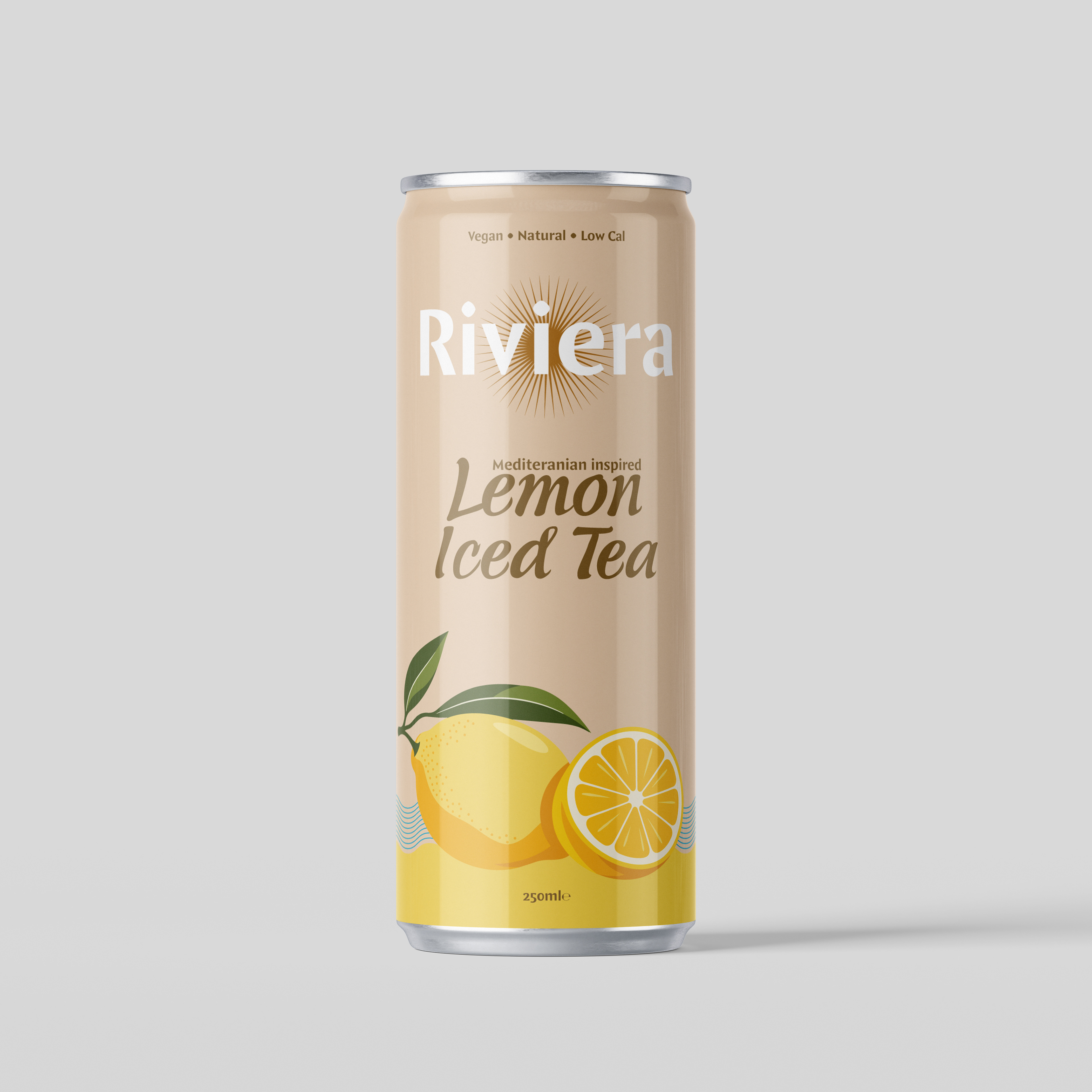
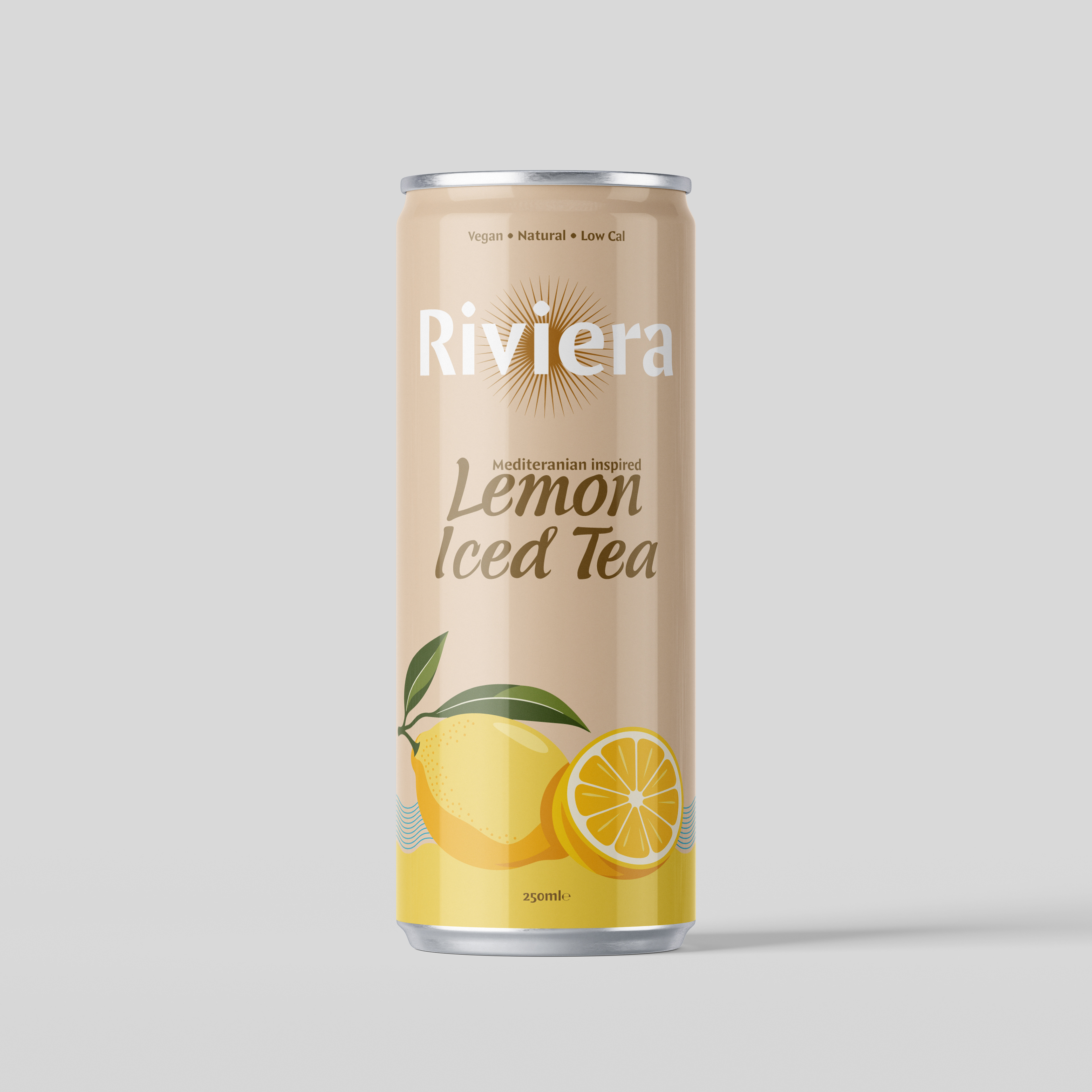
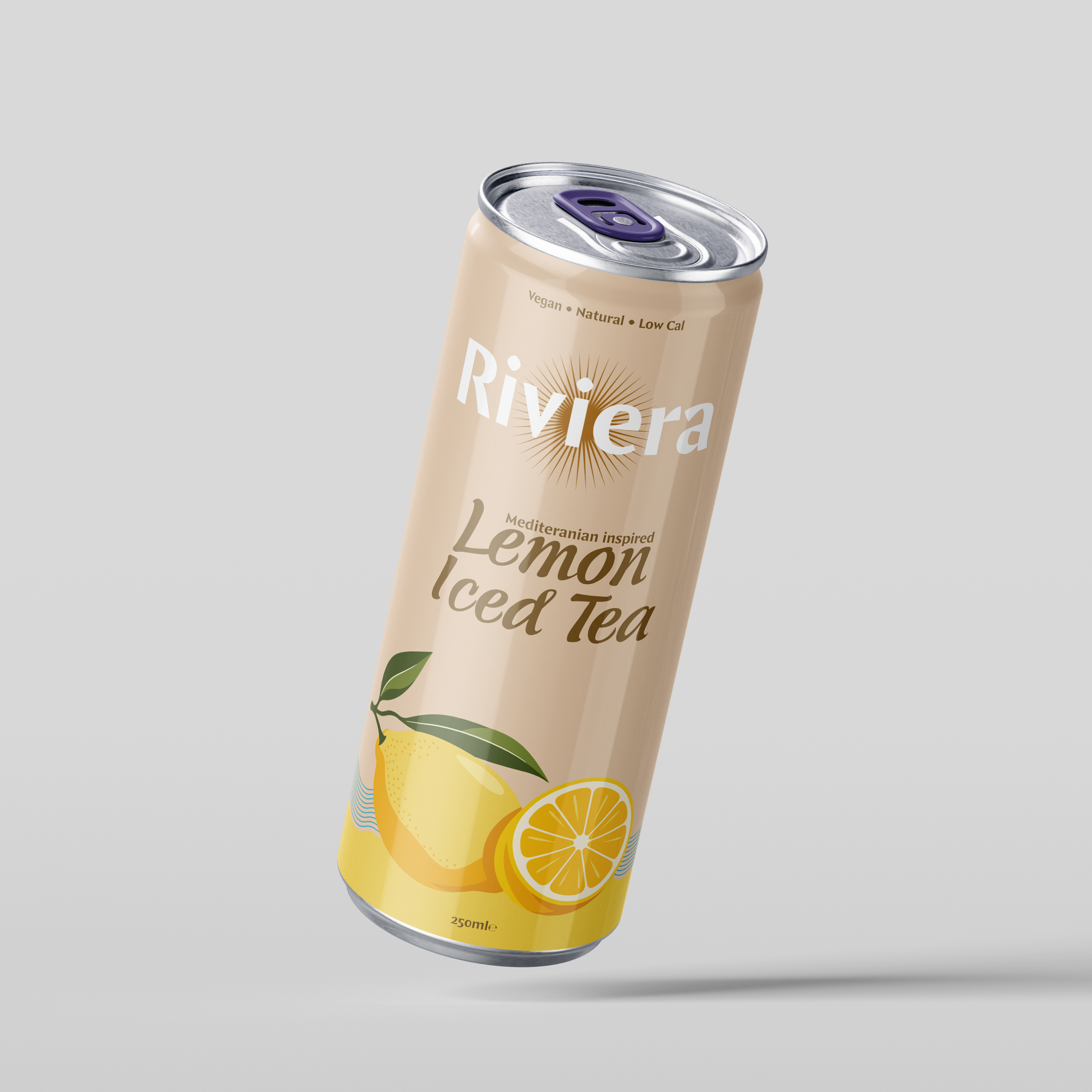
Using some, but not all of the feedback gathered, this initial design removes several of the weaker elements while introducing new aspects to elevate the existing identity. This is a quick design iteration based on initial discovery, with further exploration and more specific feedback still to be implemented and/or tested.
I've stayed as close as possible to your existing design language for this initial concept. How far you want to move away from the current identity is completely flexible, and we can explore much more significant changes or entirely new design directions if that's something your considering.
I Only designed the lemon SKU, this design can easily be translated across current SKUs with ease.
Design Development
This design looked first to address the amount of text on the existing can, working on the principle that every piece of copy should earn its place. I removed wording that felt redundant while retaining messaging that actually contributes to the product or brand story. For example, “Mediterranean inspired” was retained because it communicates provenance, lifestyle and positioning — it gives Riviera a world to belong to beyond simply being an iced tea. “A naturally delicious drink” was removed because it adds relatively little that isn't already communicated elsewhere. “Delicious” is expected of the product, while “natural” can be communicated more effectively through ingredients, imagery, colour and the existing natural claim. Removing this kind of copy gives the important information more space and creates a cleaner hierarchy.
The existing assets were then repositioned rather than fundamentally changed. The Riviera logo was moved down slightly, reducing the large gap between it and the rest of the composition. This freed the very top of the can for “Vegan • Natural • Low Cal”. This feels like a stronger position for these key product benefits: packaging is generally viewed from top to bottom, whereas small claims tucked beneath the main design are much easier to miss. It also means the benefits can be discovered immediately without competing with the main flavour communication.
Introducing the flavour visually
One of the biggest additions was flavour imagery. Rather than creating a completely separate visual device, the fruit was integrated into the existing bottom flavour indicator and wave system. This takes something already distinctive to Riviera and gives it another purpose.
The intention would be to blend the fruit further into the base colour so it feels embedded within the packaging rather than simply placed on top. Different levels of saturation were trialled to find the balance between the existing pastel identity and stronger flavour recognition. Too saturated and the fruit begins competing with Riviera's softer, natural visual language; too muted and it loses the punch required to communicate flavour quickly. The aim is somewhere between the two.
Exploring a Mediterranean visual language
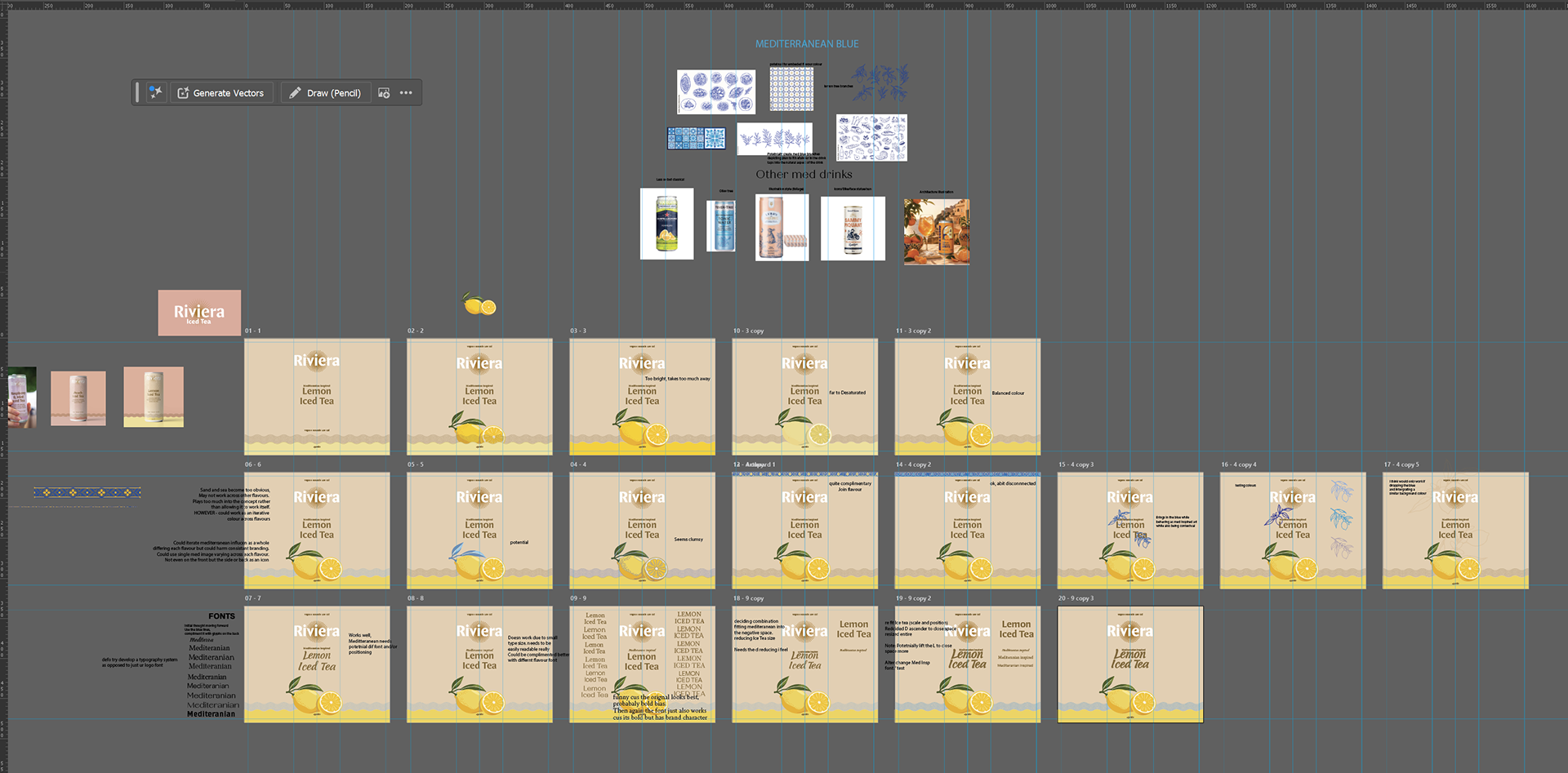
I also explored what “Mediterranean inspired” could actually look like, rather than relying purely on the words. Mediterranean blue, ceramic patterns, glyphs, botanical illustrations and different illustration styles were all considered.
I didn't land on an additional Mediterranean graphic element that I felt genuinely improved this particular front design. Most began adding complexity rather than purpose. I think there is still significant potential here, particularly across the sides/back of the packaging where there is more freedom to build out Riviera's visual world without compromising the simplicity of the front.
For this iteration, I settled on changing the existing wave strokes to Mediterranean blue. Against the lemon yellow it creates an immediate sea-and-sand association. That isn't inherently negative — it works particularly nicely for Lemon — but it becomes problematic as a fixed brand device because the same blue may not complement every flavour. One solution would therefore be for the wave colour to change alongside each SKU.
Equally, the design works without the blue. Keeping the waves in the existing neutral colour makes the coastal reference much more understated: the sand/wave idea is hinted at without being explicitly sold. There is an argument that this restraint is actually more sophisticated.
Typography and hierarchy
The concept also became an exploration of a more deliberate typographic language and hierarchy.
I trialled a lot of combinations and was genuinely on the fence between several of them. The existing Riviera typeface works very well and could absolutely continue as the primary descriptive typeface. However, using essentially the same typographic character throughout the packaging contributes to the flat hierarchy of the original, so another option was to introduce contrast.
The direction shown uses a more expressive typeface for “Lemon Iced Tea”, while keeping “Mediterranean inspired” more restrained. Its placement was deliberately offset into the negative space created by the capital L, allowing the two pieces of information to lock together as a single composition rather than simply stacking one line above another.
Iced Tea was made slightly smaller to establish hierarchy within the product name, and individual letterforms were manually adjusted where necessary to improve the spacing and balance of the lockup.
There is also an argument for making “Mediterranean inspired” even more understated. It doesn't necessarily need to sell the drink from across the room. Riviera and the flavour need to do that first; the Mediterranean positioning can become a secondary discovery once someone is closer to or holding the can. That could actually reinforce a more sophisticated hierarchy rather than trying to make every message equally visible.
Where this could go next
A lot of these decisions aren't ones I would consider finished. I deliberately wanted to produce a quick single design from the initial discovery, rather than prematurely perfecting one direction. There were several points where I could genuinely see two or three different solutions working.
A proper next stage would therefore involve producing a small number of refined iterations — testing different typography, placements, colour relationships and additional design elements — alongside more substantial departures from the existing structure.
Areas I'd particularly want to explore further include:
- Building a stronger Mediterranean visual world, without resorting to obvious Mediterranean clichés. This could include bespoke patterns, illustration styles, architectural references or more subtle visual cues.
- Adding texture to the pastel backgrounds, giving the currently flat colour more depth and tactility while retaining the softness of the existing palette.
- Breaking away from the very obvious top/middle/bottom structure of the current packaging and exploring more dynamic compositions where elements interact and overlap.
- Developing flavour names. I noticed these are already being used on the website, and there may be an opportunity to rethink and integrate them into the packaging to give each SKU more personality.
- Developing the sunburst into a stronger brand glyph. The Riviera wordmark itself is strong, but the existing sun device could potentially be refined into an ownable standalone asset that becomes recognisable without the Riviera name.
- Creating a bespoke Riviera pattern, potentially informed by Mediterranean ceramics or other regional visual references, which could be used selectively across packaging and the wider brand.
- Using the back of the can for the founder story. The front can then be allowed to sell the product visually while the back provides the human story and context behind Riviera.
- Exploring complementary flavour cues throughout the design, rather than restricting the flavour colour entirely to the bottom section. This could include subtle changes to typography, strokes, illustration details or secondary elements.
- Exploring how prominently to communicate functional benefits such as natural ingredients, refreshment and low calories.
That final point needs some restraint. There is an obvious commercial argument for making benefits such as natural, refreshing and low-calorie more prominent. However, pushing these claims too aggressively could work against the more sophisticated identity Riviera is trying to build. Premium brands often communicate confidence through restraint rather than covering the front of the product in reasons to buy it. The stronger solution may therefore be to make these benefits easier to discover without making them the visual identity of the drink.
Overall, this concept deliberately stays relatively close to Riviera's existing design language. The intention wasn't to replace what already works, but to show how removing unnecessary information, strengthening hierarchy, introducing flavour visually and making the existing assets work harder can elevate the packaging without losing its identity. From here, the design could either be refined within this framework or pushed considerably further into entirely new directions.